Master email newsletter image dimensions with this guide, covering ideal sizes, formats, and design tips to ensure your emails look great on any device.

When it comes to email newsletters, you must nail the dimensions of your images—or risk giving a poor impression of your brand right from the start.
Thankfully, tools like Canva and email platforms that can optimize your email images based on screen size have made it easier to get it right. Even with limited skill and resources, you can present a beautifully designed newsletter.
Of course, you’ll still need to get the dimensions right and follow best practices for the very best results. Let’s jump in.
What are the Ideal Dimensions for Email Newsletters Images?
Here’s what is generally considered best practice:
|
Part of Email |
Pixels |
|
Width (most images) |
600 px - 700 px |
|
Email Height |
1,500 px - 2,000 px |
|
Main Header Height |
100 px - 300 px |
|
Content Block Header Height |
100 px - 150 px |
|
Mid-Content Image Height |
300 px - 500 px |
|
Button Size |
42 px - 72 px |
Newsletter Width
In general, most email marketing professionals have always done images that are 600 pixels wide. That’s typically been a great width that looks good on both desktop and mobile—and you can use that today, no problem
With the rise of more capable computers and larger monitors, you can go a bit above that recommendation without issue, such as 700 or maybe even 800. If you want to try a bigger size, be sure you’re testing extensively in different inboxes and screen sizes (phone, tablet, desktop) to see that your images look good.
It’s worth noting that Mailchimp, HubSpot, Brevo, and Klaviyo all have their email builders default to 600 pixels, and that’s still what most users use today.
Newsletter Header Width
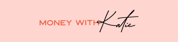
Many newsletters opt for the full-width experience with their headers (usually 600 px). It looks nice because the edges of the image align with the content beneath it.
Here’s a simple, full-width header from Money With Katie:
While some brands opt for full-width header images, going the minimalist route is increasingly common. Here’s how The Hustle does it, with their logo centered on a white background:

In this case, you don’t have to worry about the width because your logo will sit in the center. Make sure that your logo is small enough that the height of your header doesn't get out of control. In some cases, that may mean redesigning your logo so that the elements are more horizontal than vertical, but we’ll cover that next.
Newsletter Main Header Height
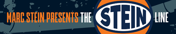
Your best bet for the banner at the top of your email is to keep it between 100 px and 300 px. Here’s the main banner from The Stein Line, which keeps to the lower end of the height recommendation:
On the other hand, some brands choose to have taller images with graphics that stack on each other rather than side-by-side. NextDraft by Dave Pell goes for the taller image, and it works for him:
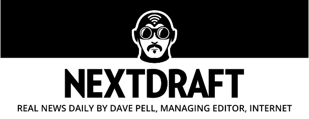
It sets the tone for his brand.
The worst mistake is to stuff too much into a short image. For example, if Dave Pell tried to put that NextDraft image into 150 pixels, the text would be crammed and unreadable on mobile. Be sure to check on various screens that your chosen image still looks good.
Full Newsletter Height
The length of your email will vary based on the email type, goal, and your brand.
However, inboxes clip emails once they reach 102 KB in total size. While that sounds limiting, it’s actually plenty of space to work with—especially since images don’t contribute to the email’s file size in the way you might expect. Images are typically hosted on a server and loaded separately, meaning they don’t count toward the 102 KB limit.
This gives you more flexibility with how much content you include. If your email is mostly text, you can write as much as you want. If you’re relying on images, like infographics or large promotional visuals, focus more on pixel dimensions (such as keeping images around 1,500 pixels in height) rather than worrying about file size.
Even if your email doesn’t hit the clipping threshold, large images can still slow down loading times and frustrate readers.
As an example of what you can get away with, a recent Marketing Brew edition had 2,500 words, 10 images, and a GIF without being clipped. If you’re using the right image format (discussed later), you can get away with this.
Newsletter Content Block Header Height
Many newsletter-style emails break up their content into specific blocks, often with a banner image separating the sections. These shouldn’t be very tall—no more than 100 px to 150 px.
Because content headers often follow the same design elements, making them 300 pixels or more is simply wasted space in a newsletter.
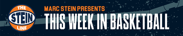
The Stein Line goes with the same dimensions for his content headers as he does his main banner, opting to keep them thin and similarly branded:
Morning Brew, by contrast, often uses simple titles, but occasionally has content header images. This one is about 50% taller than the previous example, but it’s still terrific:

These images are generally less tall than other images because it’s a simple title. People don’t need a massive header image every 100 words in an email. It’s clunky and detracts from your actual content.
Mid-Content Image Height
Many popular newsletters use images below section titles like they would in a blog post. These images enhance the post and can be a bit taller.
Still, generally try to keep these to under 500 pixels, as more than that can take up most of a screen when you want to keep people moving to your next block of content.
Here’s an example of a custom image used in The Hustle:
Newsletter Button Sizes
Studies have shown that optimal clicks happen when your buttons are between 42 px and 72 px. Anything lower than 42 pixels lowered the accuracy of button clicks, but strangely, the same was reported with buttons larger than 72 pixels.
Optimizing your buttons for clicks should also include a visual inspection—in other words, does it look good?
If you create a button with low padding (i.e., the space between the words and the edge of the button) or high padding, it can quickly look unprofessional.
Here’s a simple yet effective example of a button from House of Strauss:
The padding looks great, the color matches his scheme yet stands out from the content, and the rounded edges make it look like a button. It’s a win on all fronts!
What Image Format Should You Use?
There are three main formats of images most newsletter creators use:
- GIF - These are used for simple animations where the image loops every few seconds. For example, this could be a coffee cup with moving steam or a repeating 5-second portion of a YouTube video.
- PNG - These are used on most websites because they are high quality and can have a transparent background. PNG is the favored format for graphic and web designers.
- JPG - Widely used for sharing images, they are popular for their compression ability. This means that JPGs have much smaller file sizes than PNGs.
Generally, JPG is the file you should be using for your newsletter as you depend on a quick load time to keep visitors interested. Relying too much on GIFs or PNGs can cause slow rendering or even to have you hit the dreaded 102 KB limit.
A single GIF can be fun and engaging, but don’t rely on them to fill up your email.
How to Quickly Design Optimally-Sized Images
The simplest way to resize images or build them from scratch is to use Canva. Even the free version allows you to input a custom size:
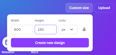
It’ll generate a canvas for you that’s the exact right size!
Now, you can choose to upload an image yourself, such as a stock photo. You can resize it or crop it to fit the pre-determined canvas size.
Or, go ahead and create something from scratch. They have an impressive selection of fonts, graphics, shapes, and more that you can play around with to generate nice images.
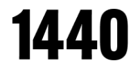
If you’re not a designer, try just typing in the name of your brand. Play around with the fonts until you find one you like and roll with it.
For example, here’s 1440’s header and they have millions of subscribers:
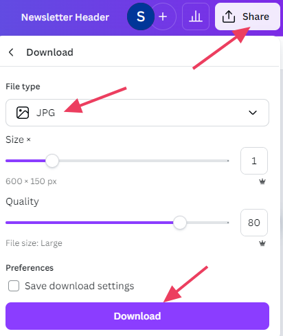
When your image is ready, you’ll first click “Share” and then change the “File type” to “JPG.” If you want to compress the image further, you can drag the bar under “Quality” to the left (using Canva’s premium version).
Then, click “Download.”
Nailing the Design Every Time
As mentioned earlier, the simplest way to ensure your newsletter looks good every time is to use a builder designed for newsletters. That way, the default settings all but guarantee that your email looks great on every screen size.
Letterhead was designed to give you a simple and powerful platform that makes designing and sending newsletters easy. Let's talk about how Letterhead can help you build, send, and scale a profitable newsletter!