Your email header is your first crack at establishing your newsletter’s brand. It’s your chance to show that you're serious, professional, laid back, funny, or whatever else you decide.
But those first pixels are important, and you’ll want to spend time considering what they say about you.
Here are plenty of examples of newsletters that nailed their brand message through great headers.
11 Email Newsletter Header Examples You Need to See
Here are some of the best newsletters at quickly establishing a brand through headers.
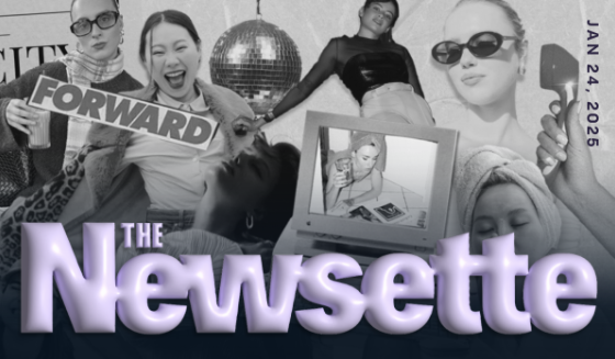
1. The Newsette
If you want a masterclass in branding, subscribe to their newsletter. There’s a reason it’s estimated to be worth $200 million.
The header is a bit busy, but that’s who they’re targeting: busy women who still make time to be fashionable, have fun, and also have a career.
The subtly purple font on top of the black-and-white montage of a busy woman conveys just the right tone. The newsletter itself is filled with clever and quippy copy that moves fast and knows what it wants to say.
This bold header starts their branding off on the right foot.
2. 1440

If you’re stressing about a complicated header, perhaps take a page from 1440’s book.
One of the largest and most successful newsletters in the world looks like they opened a Google Doc, typed out “1440” and picked a plain font. That’s it.
But it works. 1440 shares news stories without any political bias. Their whole newsletter is a no-frills, just-the-facts operation that delivers the biggest stories with ruthless efficiency.
Doesn’t their header portray that perfectly?
3. Morning Brew
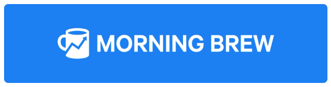
Another monster newsletter, Morning Brew’s signature blue header is recognized by millions.
From the name to the coffee mug image, they’ve done a tremendous job in helping people associate one of their favorite morning rituals (sipping coffee) with reading their newsletter. Their hope is that opening the newsletter feels as essential to their morning as their brew.
Plus, blue is known for evoking feelings of calm and trust. If your morning feels rushed, perhaps taking 5 minutes to read Morning Brew can bring a few minutes of time to relax and get caught up.
At least that’s their hope, and it’s all reinforced by a well-designed email header.
4. History Facts

History Facts keeps their header simple, but there’s beauty in the brand-building here. The red logo looks like either a bookmark or some sort of flag, but either way, it feels like something from a university.
The period at the end of their name is a small bit of genius as well. It seems to say, “we have the information. Period.” They feel trustworthy and educational, which is precisely what they’re looking for.
5. Two Percent
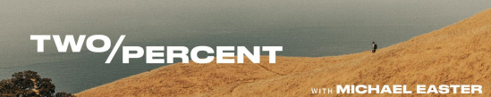
Michael Easter’s popular newsletter focuses on health & fitness, with one of his core beliefs being to get outside and get moving. That’s why his header works so well—you get a beautiful outdoor shot of him on a hike. He’s making going outside seem appealing.
Plus, the name of his newsletter makes you want to know why it’s called that. Turns out, only 2% of people take the stairs when there’s an escalator nearby. This entire header—including the name of his brand, reinforces his main idea.
6. The Stein Line
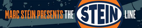
Marc Stein is one of the better-known basketball journalists over the past three or so decades, so his header makes sense.
First, comes his name. People who want to follow him know this is his publication. Then, the cool basketball logo that engulfs his last name in the newsletter’s title is a nice, fun touch. And that’s what basketball is—fun.
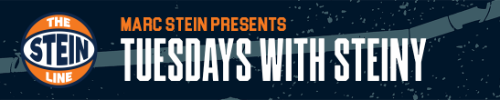
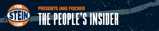
Furthermore, he uses that same image template for section breaks or specific topics. It keeps things simple for him, but continuously reinforces his brand:
7. Bloomberg Morning Briefing
Long considered a top business, tech, political, and financial publication, their morning edition seeks to provide news to a more intelligent crowd.
Their newsletter gives it a newspaper feel with the no-nonsense font and black-and-white design. In addition, the word “Briefing” makes it sound as if you’re a person of importance, and Bloomberg is there to keep you in-the-know.
Overall, a simple design here elevates and reinforces their brand.
8. The Saturday Solopreneur
Here, a simple design does its job because the three-word newsletter name says so much.
- We already know that we should expect a newsletter every Saturday. Setting expectations is a huge part of driving success with email.
- Solopreneur is a word packed with so much meaning. It means you’ve got a business mindset, but you’re also not necessarily interested in the hassle of building a company with many employees. You’re about staying lean and leveraging systems to grow.
If the name of your newsletter says as much as this one does, then a simple white background with the name is more than enough.
9. Further

Often considered one of the first successful content marketers, Brian Clark has had a tremendous impact on internet marketing.
In recent years, he started the mid-life crisis personal growth newsletter called Further.
His email header is simple, but the obvious backdrop image of a phoenix helps readers get in the mindset of rising back from the ashes to take charge of their lives in their later years. The “keep going” slogan evokes a Nike-ian “Just do it” vibe, but for people over 40 or 50 years old.
It’s a seemingly simple header that says a lot.
10. Both Are True
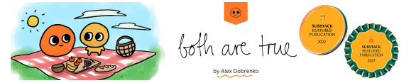
It’s honestly not super clear what that image on the left side of the newsletter is supposed to be, exactly, but that’s part of the charm.
Alex, the author, writes hilariously about things he’s pondering over, often coupled with stories from his life. His hand-drawn image, with his hand-written newsletter title convey a more personal yet laid-back style.
It’s not the easiest newsletter to peg an audience for, but this header conveys the whimsical nature of his writing.
11. Today in Design
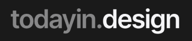
Unfortunately, a static image doesn’t do this one justice as their headline is actually a GIF. The letters fall off the screen and then pop back in from the top.
As a design newsletter, it’s expected that the newsletter pops. It does. With the black backdrop and the gray and white fonts, you get something different than just about everything else in your inbox—especially because it’s a GIF.
Plus, the title says it all: daily news about designe. It’s perfect.
Headers for Multiple Newsletters
If you run several newsletters in similar niches, designing headers (and your overall look & feel) become much easier.
For example, Forbes has over 30 newsletters. Here are just a few:
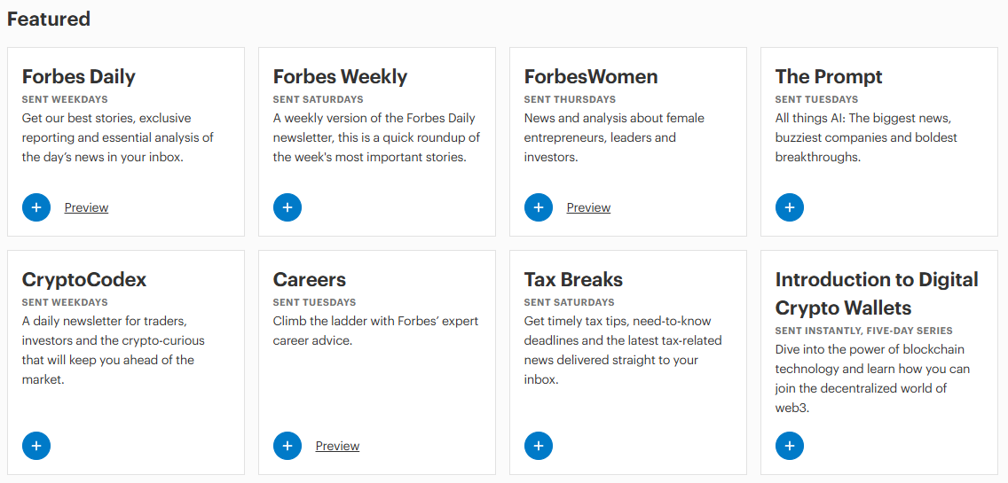
Since they all belong under the Forbes umbrella, it’s fairly easy to keep branding the same between them.
Or, what if you run a brand with various chapters across the U.S.? Keep similar headers, but just put the name of the city the newsletter is for.
Your next challenge is putting together effective newsletters that people want to read—especially if you’re sending out two dozen different ones per week.
You need a tool like Letterhead, the platform specifically designed to run and grow many newsletters at once. Let’s talk about what that looks like for your newsletters and your future bottom line.